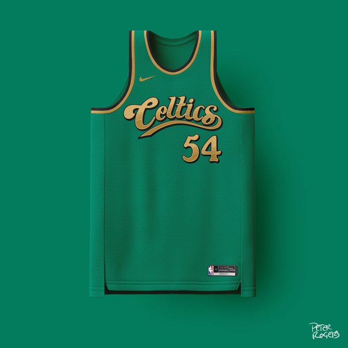
If you are not familiar, Pete Rogers designed one Celtics-themed jersey for every regular season win (57!) this season. I strongly suggest checking out the entire thread here. These were some that I really enjoyed:
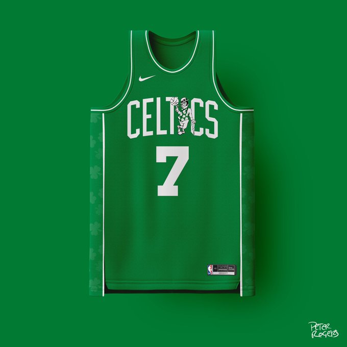
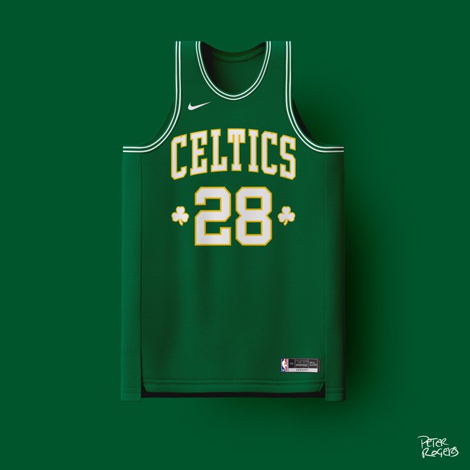
There were a ton he did that were all green, which really give me nostalgia to the Pierce years, but this one stands out for me. There’s not much to this, which I like, but I absolutely LOVE Lucky the Leprechaun as the “I” in “CELTICS”.
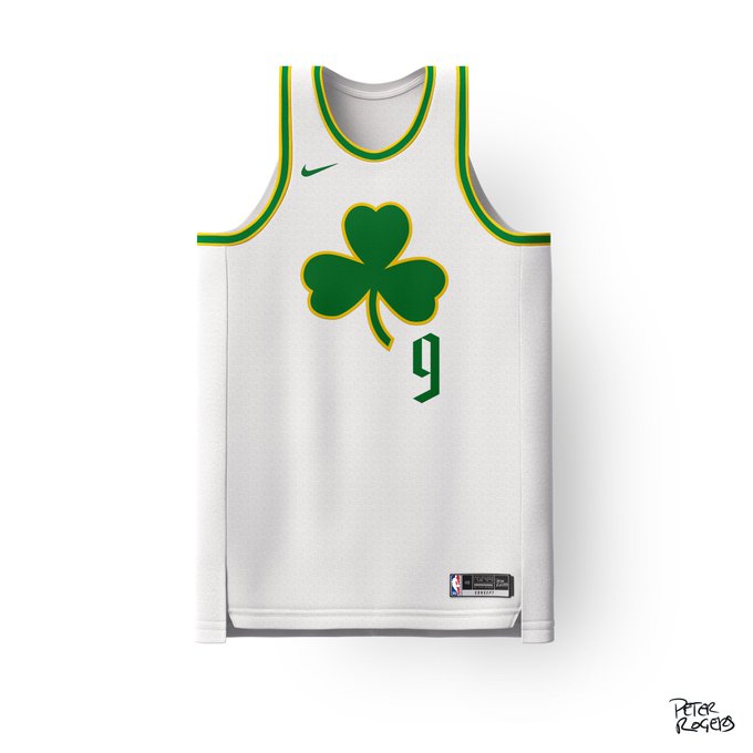
This one is cool because of the simplicity of the large shamrock on the chest. It’s as symbolic as the spoked-B in my opinion.
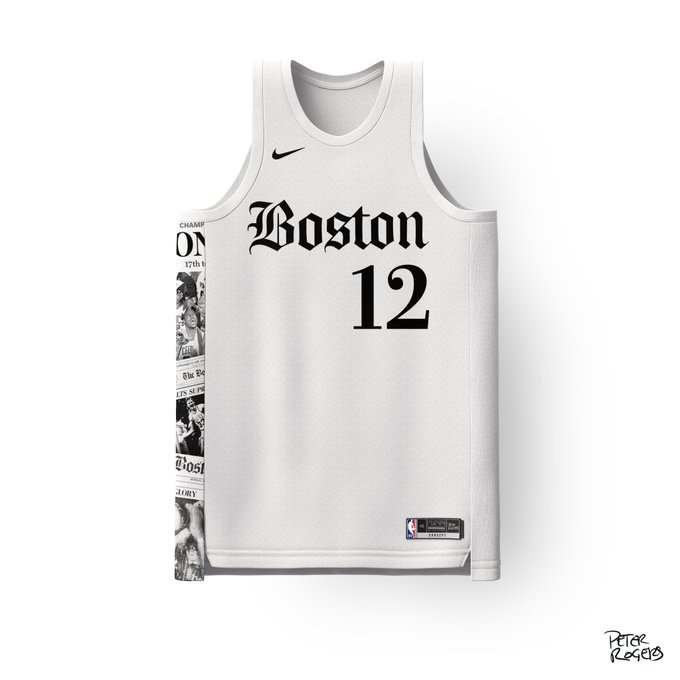
Obviously a call to The Boston Globe. I dig this one because the font is classic, and has clips of old Boston Globe stories running down the side.
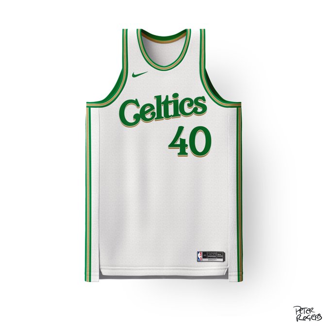
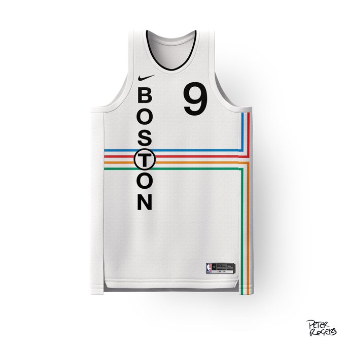
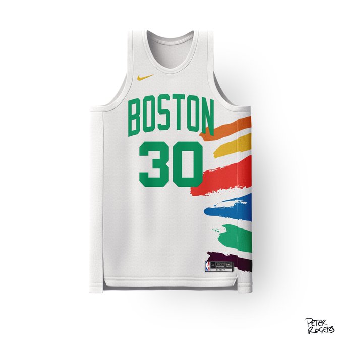
This one is just straight clean. Really like the font and of course I love a home white.
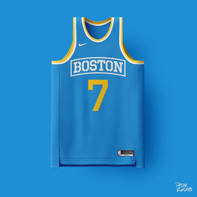
I didn’t think the blue/gold Boston Marathon-inspired design would work for the Sox (reverse colors), but it really did, and I think it could for the C’s too!
This MFer don’t miss! Nailed it with the subtle shamrock dotting the “i”.
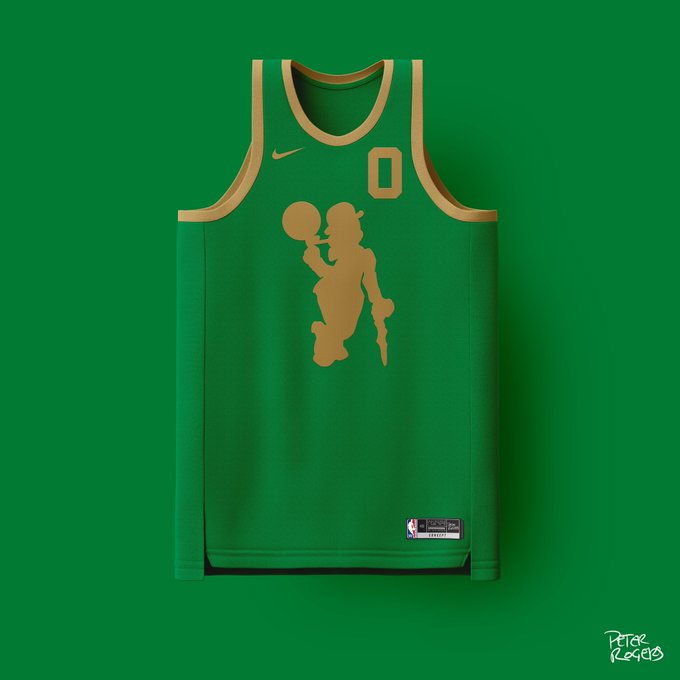
TAKE MY MONEY!!!! Love the Lucky silhouette.
MBTA-themed design WITH the T’s logo? I have no notes. Might be my favorite of the local-themed ones.
This one is underrated fire and inspired by this! I also feel like if the NBA were actually gunna pick one of these and do, it would be this one.
Took him 30 wins to FINALLY drop one everyone was asking for: Gas Tank Jersey
GINO! Didn’t know how he could do it, but it’s perfect. Even the color of the jersey matches the shirt Gino wears in the video. This one is all-time!
Ode to the Freedom Trail, this one is super unique.
Everybody ought to know Pete Rogers’ name after this season.
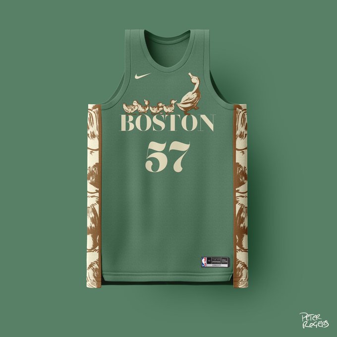
Come on man, Make Way for Ducklings, are you kidding me? Seriously one of a kind.
